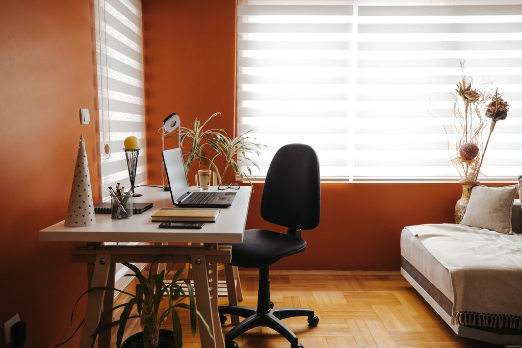
Colour theory is often referenced in terms of our wardrobes, choosing an outfit to influence our mood, but this same theory can be adopted in our homes, too. Psychotherapist Amy Thomas-Owen has teamed up with paint brand, The Paint Shed, to reveal that “sugar drenching” is the new trend for a happy home.
I’ll be honest, as a Homes Editor, I receive a lot of press releases about different home trends and theories so it’s hard to nail down what really works, but I must admit that now I think about it, two of my rooms at home that are painted green are my favourite to be in, so perhaps there’s something in it! I think choosing your favourite colour – sugar sweet or not – will certainly help you feel better.
What is “sugar drenching”?
Food is often a form of comfort, and paint colours with foodie names have been trending more than ever this year. So, if you choose a foodie-related hue for your home, the principle is that you will feel comforted, secure and even happier.
Paint expert and Managing Director at The Paint Shed, Michael Rolland, comments: “We’re seeing a clear trend of food influencing everything from paint colours, to fabrics, marketing, beauty, and fashion. Food culture has taken over everything, and it works because it’s so sensory and familiar; it gives people something they can connect with, especially in times of stress. We think that’s what’s driving the rise of what we’ve called ‘Sugar Drenching’; people want their homes to feel comforting, warm, and reminiscent of what makes them feel good.”
Psychologist Amy Thomas-Owen explains why “sugar drenching” works: “In the wake of ongoing uncertainty, from cost-of-living stress to digital overwhelm, people are understandably turning to their homes for a sense of emotional safety and comfort. Food-based tones tap into this need by evoking positive emotions and memories, and help to create spaces that feel soothing, tactile and emotionally safe.”
Which colours should you choose?
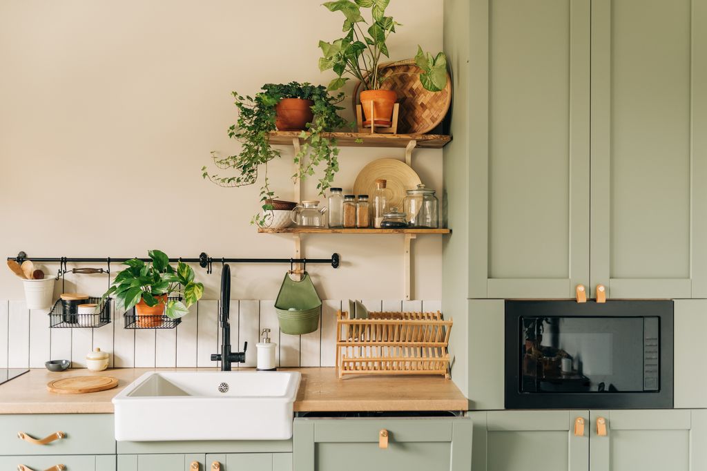
The Paint Shed says no shade is being searched more than ‘apple’, which has seen a whopping 453,000 global searches in 2025 alone, beating formidable favourites like ‘butter yellow’, ‘cherry red’, and ‘olive green’. Michael picks out Farrow & Ball’s Cooking Apple Green as the perfect example.
“It is a colour that is sweet with a little sharpness, familiar yet fresh, and grounded in tradition but a consistent crowd pleaser,” says Michael.
He continues: “It works beautifully across cabinetry, walls, or even ceilings, especially when paired with warm wood tones or toasted neutrals. Adding brass handles or warm lighting can help bring in that classic farmhouse or homely bakery feel.”
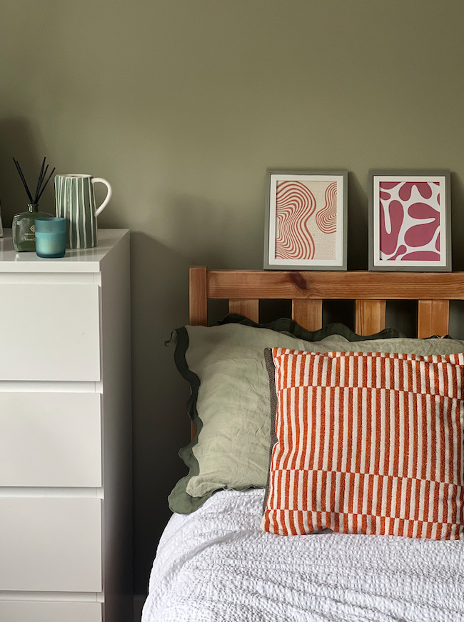
Other tasty tones recommended by The Paint Shed team include Dulux’s Fine Cream and Benjamin Moore’s Carrot Stick. I’d personally suggest Dulux’s Overtly Olive as that’s the colour of my home office/spare room – and I adore it!


